Free OG Image Generator: Make Open Graph Images
Design Open Graph images free, no sign-up or watermarks. Six templates at Meta's recommended 1200x630, exported as PNG, JPEG, or WebP in your browser.

Founder
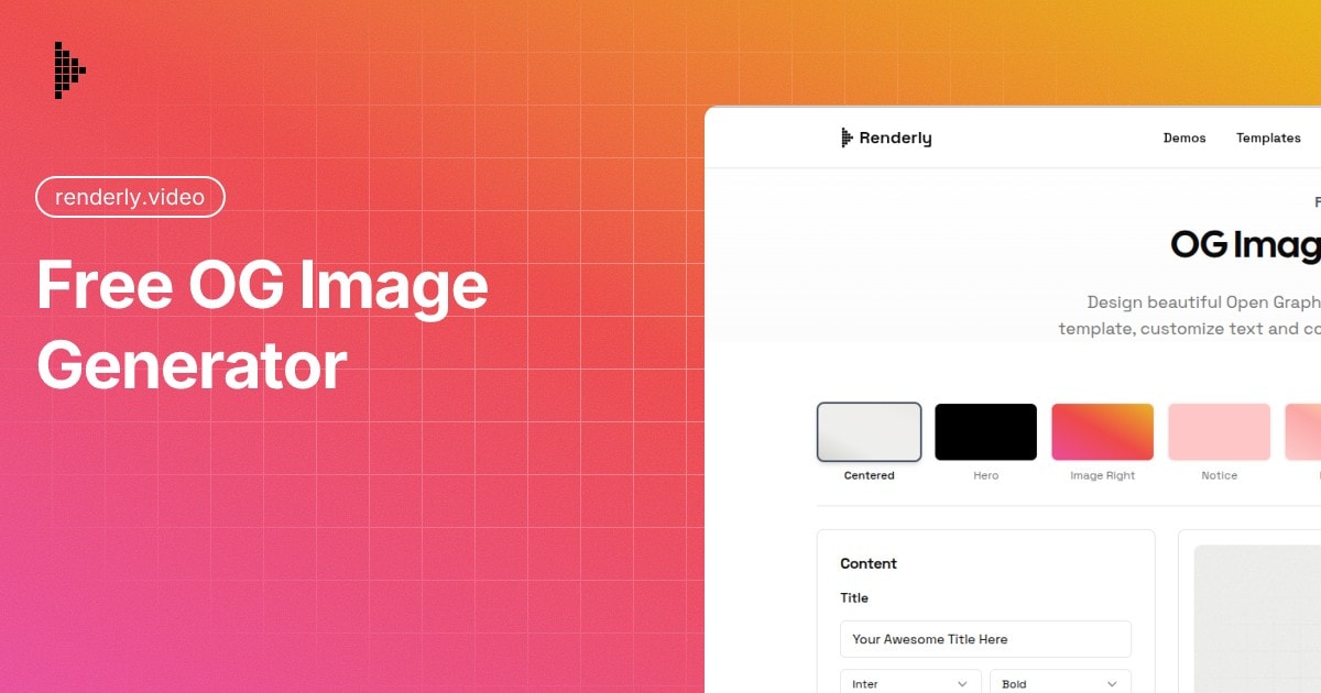
The card at the top of this page came out of the tool this post is about. It took under a minute, and that is roughly the whole argument.
Paste a link into Slack with no og:image tag and you get a grey rectangle and a URL. Paste one with a good image and you get something people actually click. The difference is a single meta tag and one 1200 x 630 PNG, and yet a startling number of launch posts ship without either, usually discovered about ninety seconds after the tweet goes out.
This guide covers what the platforms actually require, how to build a card that meets those specs using Renderly's free OG image generator, and how to check the result now that the obvious testing tool has quietly stopped working.
Key Takeaways
- Meta recommends at least 1200 x 630 pixels, allows a 200 x 200 minimum, and caps files at 8 MB.
- One 1200 x 630 image covers X, Facebook, LinkedIn, Slack, Discord, and iMessage, so per-platform variants are wasted effort.
- The generator ships 6 templates and 6 gradient presets, and rasterizes client-side via Satori and resvg-wasm. Your text and logo are never sent anywhere.
- The Twitter Card Validator is gone. Use LinkedIn Post Inspector or opengraph.xyz to test.
What Is an OG Image?
An OG (Open Graph) image is the preview graphic that appears when someone shares your URL on social media: X, Facebook, LinkedIn, Slack, Discord, iMessage, and more. It's defined by a single meta tag in your page's HTML:
<meta property="og:image" content="https://yoursite.com/og-image.png" />When a platform crawls your link, it reads that tag and displays the image as a rich preview. Without it, the platform falls back to scraping whatever it can find on the page, and often that's nothing usable. Your link ships as a bare URL.
The protocol itself is old and boring, which is the good news. Open Graph has been stable for over a decade. Get the tag right once and every platform picks it up.
Why Do OG Images Matter?
The platforms tell you they matter, in their own documentation. Meta's sharing guidance asks for images of at least 1200 x 630 pixels for high-resolution devices, sets a hard minimum of 200 x 200, and rejects files over 8 MB (Meta for Developers). Platforms don't publish specs for decoration. They publish them because the preview is the unit of distribution.
Beyond the specs, three things hold up without needing a statistic behind them:
- It's cheap. Sixty seconds, once, per URL.
- Expectation setting. A preview that matches the page narrows the gap between what someone thinks they're clicking and what loads. That matters more for bounce rate than for clicks, and it's the effect nobody bothers to quantify.
- Brand recognition. Keep the treatment consistent and your posts become identifiable in a feed before anyone reads a word of the headline. This one compounds, which is why it's worth picking a template and staying with it.
A note on the click-through numbers you'll see quoted
Search for "OG image click-through rate" and you'll meet a wall of confident figures: 2-3x more clicks, a 48% lift, a 2.3x A/B test win, 70% more shares. They're attributed to Hootsuite, HubSpot, and Semrush.
We went looking for the primary sources in September 2026 and could not find one. Not a study behind a paywall, not a methodology page, nothing: no page quoting these figures links to the research it names, and searching the named publishers directly turns up nothing that matches. The numbers circulate between marketing blogs citing each other, and the attribution hardens with every hop. The closest thing to a real experiment we turned up is a Hootsuite test of promoted tweets, and it measured something else entirely - standalone image posts against link previews - while reporting its own click rate two different ways in the same article.
An earlier version of this post repeated the "2-3x" figure. We've removed it, because we can't stand behind it.
So the honest version: we don't have a defensible number for how much an OG image lifts clicks, and neither does anyone else quoting one at you. What we do have is the platform specs, which are real, published, and worth following.
What Size Should an OG Image Be?
Use 1200 x 630 pixels. That satisfies Meta's high-resolution recommendation, sits at the 1.91:1 aspect ratio Meta asks for to avoid cropping in Feed, and works everywhere else.
Here's how that one image lands across the platforms people actually share on:
| Platform | Behavior at 1200 x 630 |
|---|---|
| X | Full-width card, but only with twitter:card set to summary_large_image; without it you get the small card |
| Matches the recommended size and 1.91:1 ratio exactly | |
| Renders full width; test with Post Inspector | |
| Slack | Inline unfurl preview |
| Discord | Embed preview |
| iMessage | Rich link preview |
Stick with 1200 x 630 and you're covered. The variation between platforms is in how much they crop, not in what they want.
How to Create an OG Image (Step by Step)
Here's how to design and export one using Renderly's free OG image generator. It takes about a minute.
Step 1: Choose a Template
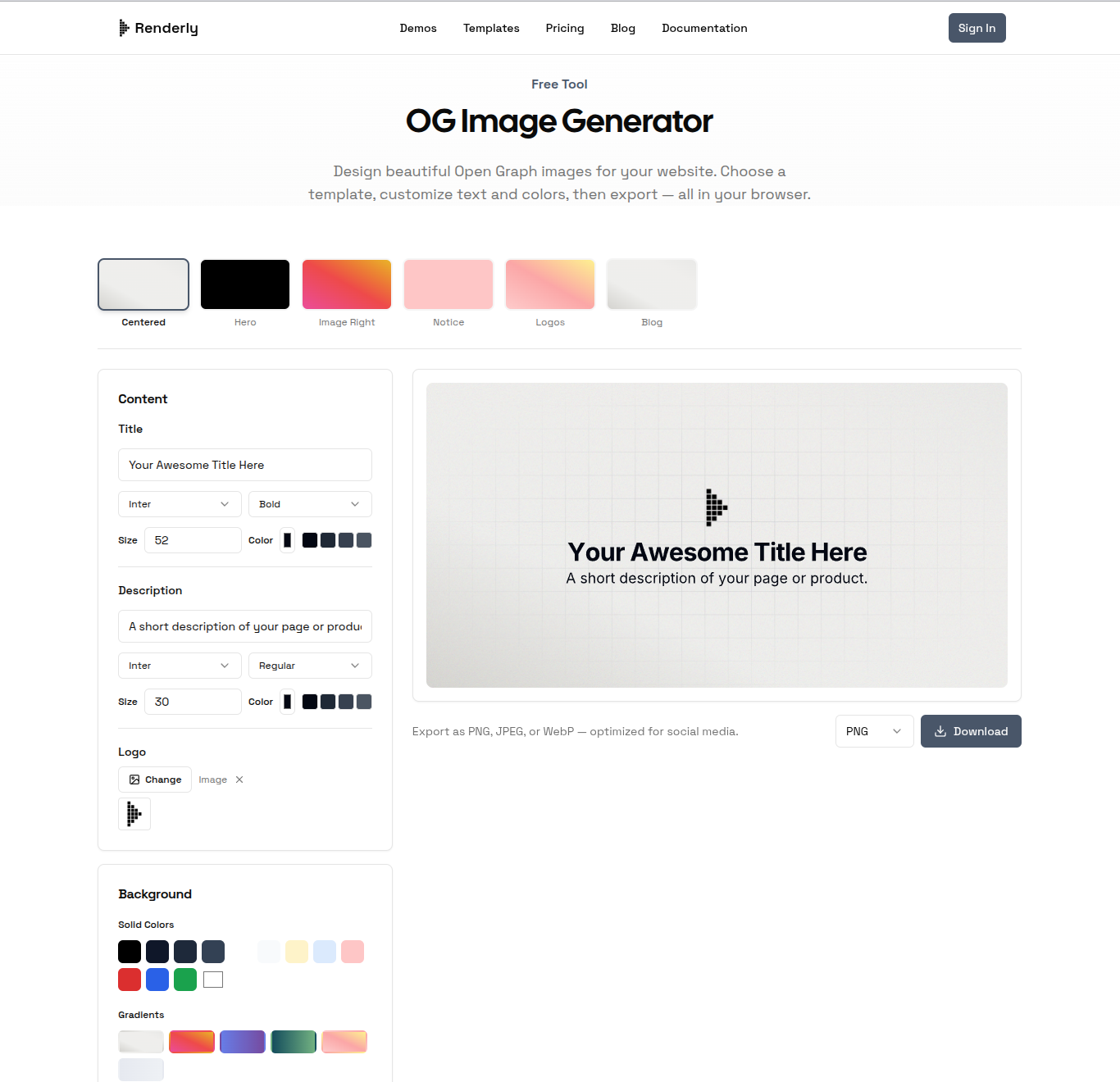
Open the tool and pick a layout. There are six, all pre-configured at 1200 x 630:
- Centered. Title and description over a background. The safe default.
- Hero. Bigger title, more room, built for a landing page or a launch announcement where the headline is doing all the work.
- Image Right. Text left, your own uploaded image right. This is the one to reach for on a product page, since a real screenshot beside the words is worth more than any amount of typography.
- Notice. Compact and high-contrast, for changelog entries.
- Logos. Leaves space for a logo row. Built for integration pages, partner lists, and anything shaped like "works with".
- Blog. Editorial layout with a byline slot.
Step 2: Customize Your Content
Edit the text fields to match your page. Every text field carries its own font family, weight, size, and color, so the title and description can be styled independently:
- Title - Short and punchy. This is the first thing anyone reads in a preview.
- Description - A brief supporting line. Not every platform shows it, so the title has to stand alone.
- Logo - PNG, JPG, SVG, or WebP. The file is read off your machine with
FileReaderand inlined as a data URL, so despite the word "upload" on the button, nothing is ever sent anywhere. An SVG stays crisp at any size and is the better choice if you have one.
Six fonts are available, all served from the Fontsource packages on jsDelivr: Inter, Poppins, Montserrat, Roboto, Manrope, and Fira Code. Weights run from Light (300) to Black (900), depending on the family.
Step 3: Style the Background
Pick one base, then stack effects on top of it. The base is either a solid color or a gradient, never both, because choosing one replaces the other:
- Solid color. Twelve swatches covering black, four slate tones, four near-whites and pastels, plus red, blue, and green. There's also a full color picker beside them, so a solid background can be any hex value you want.
- Gradient preset. Six: Warm, Sunset, Ocean, Forest, Peach, and Arctic. These are fixed presets. There's no stop editor or direction control, so if you need a specific brand gradient, the custom solid picker is the closer fit.
Two effects then layer over whichever base you chose:
- Noise, a 0 to 50% slider that adds fine grain. Every template ships with a little of this already on, which is most of why the defaults don't look flat.
- Grid Overlay, off until you add it, and the most useful control in the panel once you do. Choose Grid, Graph Paper, or Dots, then set its color, opacity, and an Edge Fade that feathers the pattern out toward the borders so it reads as texture rather than wallpaper.
Step 4: Export
Pick a format and hit download:
- PNG. Best text sharpness and the safest choice everywhere, which is why it's the default.
- JPEG. Smaller files, exported at quality 0.9. Worth it when the design leans photographic.
- WebP. The best compression of the three. We'd treat it as the adventurous option rather than the safe one: crawler support for WebP as an
og:imagehas historically lagged support for WebP in a normal<img>tag, and we haven't tested it across every platform. If a launch depends on the preview rendering, ship PNG.
Meta's 8 MB ceiling is generous enough that a text-and-gradient card won't approach it. Do keep an eye on it if you crank the noise slider up and drop in a photo, since grain is close to incompressible and PNG has no answer to it.
How Does Browser-Side Rendering Work?
Nothing you type reaches a server. The pipeline runs in three stages inside the page, and the only requests that cross to another origin are for font files.
Satori turns the template into an SVG. Then resvg-wasm rasterizes that SVG to a PNG inside a Web Worker, so a heavy render doesn't freeze the interface. JPEG and WebP come from passing the PNG through an OffscreenCanvas.
Worth being precise about what "runs in your browser" does and doesn't mean here, since privacy claims deserve exact wording. Three kinds of request happen, and none of them carries your content:
- Font files, one per distinct family-and-weight pair, from the Fontsource packages on jsDelivr. Style the title in Poppins Bold and the description in Inter Regular and that's two requests.
- The WebAssembly rasterizer itself,
resvg.wasm, served from this site as a static asset on first use. - Nothing else. Your text, your colors, and the logo you upload stay in the page. The logo is read with
FileReaderinto a data URL, so it never becomes an upload at all.
One correction while we're here, because an earlier version of this post got it wrong: the fonts are not WebAssembly. They're plain .woff files. The WebAssembly is resvg, the rasterizer.
How to Add an OG Image to Your Website
Once you've downloaded your image, reference it from your page's <head>.
Basic HTML Meta Tags
The image tag is the one people remember, but an image on its own produces a card with a picture and no words. Ship the whole set:
<head>
  <!-- Open Graph -->
  <meta property="og:type" content="article" />
  <meta property="og:url" content="https://yoursite.com/your-page" />
  <meta property="og:title" content="Your page title" />
  <meta property="og:description" content="One sentence about the page." />
  <meta property="og:image" content="https://yoursite.com/og-image.png" />
  <meta property="og:image:width" content="1200" />
  <meta property="og:image:height" content="630" />
  <meta property="og:image:alt" content="Description of your image" />

  <!-- X / Twitter Card -->
  <meta name="twitter:card" content="summary_large_image" />
  <meta name="twitter:image" content="https://yoursite.com/og-image.png" />
</head>Two things go wrong here more than anything else.
Use absolute URLs. A relative og:image path is the single most common reason a preview comes up blank. The crawler fetches your HTML without page context and has nothing to resolve /og-image.png against.
Don't skip twitter:card. Without it X falls back to the small square card no matter how well-proportioned your image is. It's the one tag whose absence looks like a design mistake rather than a missing tag.
Next.js (App Router)
export const metadata = {
  openGraph: {
    images: [
      {
        url: "https://yoursite.com/og-image.png",
        width: 1200,
        height: 630,
        alt: "Description of your image",
      },
    ],
  },
  twitter: {
    card: "summary_large_image",
    images: ["https://yoursite.com/og-image.png"],
  },
};In practice most Next.js projects set metadataBase once in the root layout and then use relative paths everywhere else, which is what this site does:
// app/layout.tsx
export const metadata = {
  metadataBase: new URL("https://yoursite.com"),
};With that in place, images: ["/og-image.png"] resolves to an absolute URL at build time and the absolute-URL rule above takes care of itself.
WordPress
SEO plugins like Yoast and Rank Math have a "Social" tab where you upload the image directly. No code needed.
Static Sites (Hugo, Jekyll, Astro)
Most static site generators expose a frontmatter field that the theme wires into the meta tag:
---
title: "Your Page Title"
image: /images/og-image.png
---Check your theme's docs for the exact field name, since it varies.
How Do You Test an OG Image?
Deploy the page first, then check the preview before the link goes anywhere near a feed. Two tools work without an account:
- LinkedIn Post Inspector - Shows the parsed tags and the rendered card, and force-refreshes LinkedIn's cache.
- opengraph.xyz - Previews one URL as several platforms at once. The fastest first check.
Meta's Sharing Debugger is the authoritative option for Facebook, and it's also how you purge a stale Facebook cache. It needs a Facebook login.
The Twitter Card Validator is gone. Most guides still send you to cards-dev.twitter.com/validator. We checked it on 2026-09-07: it redirects to an X login wall and validates nothing. X's current developer documentation index no longer carries a Cards section either, and the old card URLs 404. The markup still works, so keep the twitter:card tags. You just can't preview X cards with a first-party tool anymore, which is why opengraph.xyz has become the practical substitute.
Platforms cache previews aggressively. If you update an image and the old one persists, purge it with the platform's own tool rather than waiting.
Tips for Designing Effective OG Images
Keep text large. Previews often render around 600px wide on mobile. Text that reads fine at 1200px can turn to mush at half that. Aim for a minimum equivalent to 40-48px at full resolution. The generator's per-field size control is there for exactly this.
Use high contrast. Light-on-dark or dark-on-light survives both platform themes. Mid-tone text on a mid-tone gradient does not.
Include your brand. A logo or a consistent color treatment builds recognition over dozens of shares. That's the compounding part.
Don't overcrowd. A title and maybe a subtitle. OG images are thumbnails, not infographics.
Keep content away from the edges. Platforms crop differently at the margins. Anything important within roughly 40px of an edge is at risk.
Test before you share. Not after. A broken preview on a launch post is not recoverable, because the cache outlives your patience.
OG Image Generator vs. the Alternatives
Design tools (Figma, Canva). Full creative control, slow for this specific job. You set up the canvas, design from scratch, export. Reasonable if the image is genuinely bespoke, overkill for text on a gradient.
Dynamic OG image APIs (Vercel OG, Cloudinary). The right answer at scale. If you need a unique preview for every one of 800 blog posts, generate them programmatically. Requires developer setup and hosting.
A browser generator like ours. The sweet spot for one-off pages. Pick a template, type, style, download. No account, no install, no code. Good for a launch page, a blog post, or a docs section.
No OG image. Your link ships as a bare URL. It works, it just looks unfinished.
This one is part of a small set of browser tools we keep free. The video resizer is the closest cousin, since reformatting a clip between aspect ratios is the same problem as fitting a card to 1.91:1. The rest are at /tools, and if you'd rather trim a clip than design a card, we wrote up how to trim video in your browser.
Wrapping Up
An OG image takes under a minute and attaches to every future share of that URL. The platform requirements are simple and published: 1200 x 630, under 8 MB, close to 1.91:1. Meet those and you're done.
If you need one right now, try Renderly's free OG image generator. Six templates, six gradients, three export formats, no sign-up, no watermarks, and nothing leaves your browser.
And if you're building a site that needs a unique card for each of eight hundred pages, that's a job for an API rather than a form. Our API docs cover the programmatic route.